After being inspired by a visit to the Hampton Court Flower Show I was ready to post images of floral fabrics and wallpapers that we have used in various projects. It quickly became apparent that we have hardly used them at all! Usually as just a hint or accent in the accessories; cushions, throws or lampshades.


We have regular visits from suppliers with books of new fabric and wallpaper collections, and there are so many very beautiful representations of flowers, colours and textures, which we do suggest to clients.
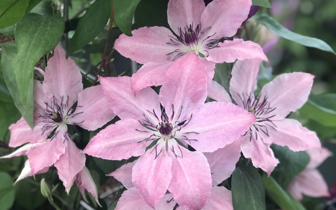
The word “floral” itself can conjure up notions of being old fashioned, feminine, soft, wishy-washy pastel colours or a choice of large and bold or small and ditsy prints. Floral suggestions can be quickly rejected by one half of a client couple, or kept to neutral rooms like guest bedrooms and bathrooms. We then move towards a leaf, feather, fern or botanical style instead.


Researching formal definitions I found this article from The Spruce, “Names of Common Fabric Patterns and Types” which is interesting in itself and may be helpful to understand the background and to express pattern preferences.
https://www.thespruce.com/guide-to-common-fabric-patterns-and-types-3862921
The skill with using florals, indeed any pattern or print, is understanding the scale of the pattern or print, the colours and tones used within it, and how to add contrasting and complementary colours and textiles.

So if the word floral is mentioned please do not dismiss it outright, ask for more specific details, investigate and explore. We would love to use them more!